Table of Contents
hide
Introduction (Fundamentals of DV)
- Data visualization(DV) is both an art and a science. It involves a creative design process along with a thorough understanding of the data and the principles of effective communication.
Definition of DV
- Data visualization is a powerful tool that translates complex data into a visual format, making it easier to understand, analyze, and draw insights.
- Data visualization is the representation of data/information in a graphical or visual format to help people understand the patterns, trends, and insights within the data.
- Data visualization is a powerful tool for transforming raw data into actionable insights, enabling better decision-making, improving communication, and fostering a deeper understanding of complex information.
Characteristics/Features of DV
- Data Visualization involves creating visual elements such as charts, graphs, and maps to make complex datasets more accessible and interpretable.
- DV involves creating visual elements such as charts, graphs, and maps to make complex datasets more accessible and interpretable.
- We process visual content 60,000 times faster than text. What’s more, visuals are far more memorable than text. In another way, The same research study found that after three days, text subjects retained 10-20% of written or spoken information while whopping(tough contents) 65% of visual information.
Objectives of DV
- The primary goal of data visualization is to communicate information clearly and efficiently, aiding decision-making and understanding.
Basic/Fundamental Principles of Data Visualization
- The basic principles of data visualization provide guidelines for creating effective and meaningful visual representations of data. Effective data visualization relies on several basic principles to ensure clarity, accuracy, and the communication of insights.
- By following these principles, we can create data visualizations that effectively communicate insights, facilitate understanding, and support decision-making.
- Some common basic principles for creating an effective data visualization are:-
-
- Know your goal:
- The primary goal of a visualization is to convey information clearly and accurately.
- Clarity and Simplicity:
- It is suggested to keep visualizations clear and simple to understand by focusing on the most important information.
- Also, avoid cluttering the visualization with unnecessary elements that may distract or confuse viewers from the main message.
- If possible, use clear labels, titles, colors, legends, and formatting to convey information effectively to provide context and guide interpretation.
- It is ensured that the visualization is easy to understand at a glance.
- Try to avoid ambiguity or confusion in the presentation of data.
- Use the right data type:
- Try to use proper and suitable data types to develop data visualization so that presentation will be better.
- Select suitable visualizations
- It is also suggested to use proper and suitable visualization techniques to develop effective data visualization so that the presentation will be better.
- Accuracy:
- It is suggested to represent the data accurately without distorting or misleading the viewer. For this, it is ensured that the visualization accurately represents the underlying data without distorting or misinterpreting it.
- For this, use appropriate scales, axes, and data representations to maintain accuracy and avoid misinterpretation.
- Indicate any limitations or assumptions associated with the data.
- Relevance:
- It is suggested to focus on displaying relevant information that aligns with the goals and objectives of the visualization.
- Also, highlight the key insights and trends that are important for the audience to understand.
- Again, present only relevant data that directly contributes to the intended message or insights.
- Try to avoid including unnecessary details that do not add value or distract from the main story.
- Consistency:
- It is suggested to maintain consistency in the design of visual elements such as colors, fonts, styles, and symbols throughout the visualization.
- Consistency helps viewers to improve readability and enhances the overall aesthetic appeal, interprets the information more easily, and reinforces visual patterns.
- Hierarchy and Emphasis:
- Try to use visual hierarchy to prioritize information, to guide viewers’ attention, and to emphasize important elements of the data.
- Also, highlight key data points, trends, or comparisons using visual cues such as size, color, or positioning.
- Interactivity:
- It is suggested to incorporate interactive features, such as tooltips, filters, and drill-down capabilities, to allow viewers to explore the data and gain deeper insights.
- Interactivity enhances engagement and enables users to interact with the visualization dynamically.
- Also, make the visualization engaging and interactive where appropriate. Allow users to explore the data interactively, zoom in on specific details, or filter the data to focus on relevant subsets.
- Context:
- It is suggested to provide appropriate context and background information to help viewers understand the significance of the data.
- For contexting, titles, captions, annotations, legends, descriptions, etc. are included to provide context and clarify the meaning of the visualization that explains the background, methodology, and implications of the findings.
- Accessibility:
- It is suggested to ensure that visualizations are accessible to a wide range of users, including those with disabilities. For this, accessible design principles are used, such as providing alternative text for images, Using accessible color schemes, designing interactive features, and ensuring compatibility with assistive technologies, in the making of visualization.
- Design for Aesthetics:
- Pay attention to the visual aesthetics of the visualization, including color palettes, typography, and create visually appealing designs that engage viewers and encourage exploration of the data.
- Choose an effective medium and channel
- It is suggested that try to use an effective medium and channel to explore the visualization effectively.
- Trends in market research
- It is suggested that try to create those types of visualization that are in current market trends.
- Data visualization dashboards
- Create a well-defined dashboard to control and handle the visualization effectively.
- Feedback and Iteration:
- Gather and solicit feedback from users and stakeholders to identify areas for improvement and iterate on the visualization design based on their input/feedback to enhance clarity, usability, and effectiveness.
- Continuously refine and improve the visualization to better meet the needs of the audience and achieve the desired outcomes.
- Know your goal:
Benefits/Importance/Advantages of DV
- Data visualization is crucial in various fields due to its ability to present complex information in a visually accessible and understandable manner.
- There are the following advantages of Data Visualization:-
- Quick/Enhances Understanding:
- Visualizations make it easier to grasp even complex information quickly in simple form.
- Visualizing data helps individuals better understand patterns, trends, and insights within the data that may not be immediately apparent in raw numbers or text.
- Visual representations make it easier for people to grasp complex concepts, making data more accessible to a wider audience, including those without a strong background in data analysis.
- Pattern & Trend Recognition:
- Visual representation of information helps in identifying particular & specific trends and patterns.
- Visualizations make it easier to identify patterns, trends, and outliers within datasets. This is crucial for recognizing opportunities, detecting anomalies, and understanding the underlying structure of the data.
- Time-series graphs, scatter plots, and heatmaps, among other visualizations, are effective in revealing patterns over time or relationships between variables.
- Facilitates Decision Making:
- Data Visualization also helps in decision-making by studying the information in visual form and gives a clear view of relevant information.
- Decision-makers can quickly analyze visualized data to make informed and timely decisions. Visualization allows for a rapid assessment of the current situation and identification of key factors influencing the decision-making process.
- Interactive visualizations can empower users to explore data dynamically, adjusting parameters and filters to gain deeper insights.
- Comparison and Analysis:
- Visualizations facilitate the comparison of data points, helping users to analyze relationships and make informed comparisons between different categories, time periods, variables, or others.
- Data visualization is a fundamental component of exploratory data analysis (EDA). Analysts and data scientists use visualizations to explore datasets, test hypotheses, and gain an initial understanding of the data’s characteristics.
- EDA visualizations can reveal distribution patterns, correlations, and potential areas for further investigation.
- Efficient Communication:
- Visualizations provide a concise and efficient way to communicate complex information. Charts, graphs, and maps can convey a message more quickly than raw data, which may be challenging for non-experts to interpret. Thus, Data visualization facilitates effective communication of data insights to a diverse audience.
- Well-designed visualizations can convey complex information more efficiently than textual or tabular representations. They tell a story and communicate findings in a compelling and memorable way.
- Charts, graphs, and maps enable the communication of key insights to stakeholders, clients, or the general public, fostering better understanding and engagement.
- Cross-Platform Compatibility:
- Data visualizations should be compatible across different devices and platforms to ensure that users can access and interpret the information seamlessly, whether on a desktop, tablet, or mobile device even with different operating systems.
- Anomalies Detection:
- Visualizations are effective tools for identifying anomalies, outliers (An outlier is a single data point that goes far outside the average value of a group of statistics), and unexpected patterns within datasets. These anomalies may indicate errors in data collection, outliers in a population, or potential areas of concern.
- Detecting anomalies early can lead to a more accurate analysis and better decision-making.
- Improves Memory Retention:
- Humans are often better at remembering information presented visually compared to textual or numeric data. Visualizations create a lasting impression, helping individuals remember key insights and trends.
- Infographics and charts with compelling visual elements enhance the retention and recall of information.
- Promotes Data-Driven Culture:
- By making data more accessible and engaging, visualization encourages organizations to adopt a data-driven culture. Teams are more likely to leverage data for decision-making and problem-solving when they can easily interpret and act upon the information presented.
- Quick/Enhances Understanding:
Challenges/Disadvantages/Demerits of DV
- Misinterpretation: Visualizations can be misinterpreted if not designed carefully or clearly.
- Data Quality: Poor data quality or partial data availability can lead to inaccurate visualizations.
- Overloading Information: Too much information in a single visualization can be overwhelming.
Tools/Software of DV
- There are the following software tools widely used in Data visualization work : –
- Tableau : A popular and widely used powerful data visualization tool.
- Power BI : It is also a top-level widely used commercial-level software tool. It is a Microsoft business analytics service for creating interactive visualizations.
- D3.js : A JavaScript library for creating dynamic and interactive data visualizations.
- Matplotlib and Seaborn : It is a Python library for creating static and dynamic visualizations.
- Chartblocks : Chartblocks is an easy way-to-use online tool that requires no coding and builds visualization from databases, spreadsheets, and live feeds.
- Datawrapper : Datawrapper is aimed squarely at publishers and journalists. The Washington Post, VOX, The Guardian, BuzzFeed, The Wall Street Journal, and Twitter(now X) adopted it.
- Visual.ly : Visual.ly is a visual content service. It has a dedicated data visualization service and an impressive portfolio that includes work for Nike, VISA, Twitter(now X), Ford, The Huffington Post, and the National Geographic.
Formats/Representations of Data Visualisation
-
Data visualization can take various forms or formats or ways of representation, depending on the type of data being visualized, the audience, and the goals of the visualization.
- These are just some of the many formats and techniques used in data visualization.
- The choice of format depends on factors such as the nature of the data, the objectives of the visualization, and the preferences of the target audience.
- Effective data visualization selects the most appropriate format to effectively communicate insights and support decision-making.
-
Some common formats/representations used in data visualization are as follows:-
- Charts and Graphs:
- Line Chart: Effective for displaying trends or patterns over time and changes over continuous intervals.
- Bar Chart: Used to compare individual data points or discrete categories or display frequency distributions or show trends over time.
- Histogram: Displays the distribution of numerical data by dividing it into bins or intervals.
- Pie Chart: Represents/shows the proportions of different categories or percentages of a whole.
- Scatter Plots: Display the relationship between two variables.
- Tables and Matrices:
- Heatmap: Uses color gradients to represent values in a matrix or table, often used for displaying correlations or relationships.
- Pivot Tables: Summarizes and aggregates data in a tabular format, allowing users to explore and analyze data dynamically.
- Diagrams and Networks:
- Network Graph: Displays nodes (entities) and edges (relationships) in a network, often used for social networks, transportation systems, or communication networks.
- Sankey Diagram: Visualizes flow or connections between entities, showing the transfer or distribution of quantities.
- Venn Diagram: Represents the relationships between different sets or groups of data, showing intersections and overlaps.
- Infographics(Data Storytelling):
- It combines visual elements such as charts, graphs, icons, and text to convey information and tell a story in a visually engaging way.
- It combines visualizations into a narrative to tell a compelling story with the data.
- It uses annotations and titles to guide the viewer through the key points.
- Dashboards:
- It is an interactive and controlling displays that combine multiple visualizations, allowing users to explore and analyze data from different perspectives.
- It is often used for real-time monitoring, decision-making, and performance tracking in business intelligence applications.
- Text-based Visualization:
- Word Clouds: It visualizes word frequency or importance in a text corpus, with larger words representing higher frequency or importance.
- Sentiment Analysis: It visualizes sentiment scores or sentiments over time, often using line charts or bar charts.
- 3D Visualizations:
- It represents data in three-dimensional space, allowing users to explore relationships and patterns from different perspectives.
- It is used in scientific visualization, virtual reality (VR), and immersive analytics.
- Interactive Visualizations:
- It allows users to interact with and explore data dynamically, such as filtering, zooming, panning, and drilling down into details.
- It enhances engagement and facilitates deeper insights by empowering users to control and manipulate the visualization.
- Maps:
- Choropleth Map: Uses symbols or color-coded regions to represent data values for geographical areas.
- Bubble Map: Shows data points on a map with varying sizes of bubbles to represent values.
- Cartogram: Distorts the geographical areas based on data values to visualize proportional representation.
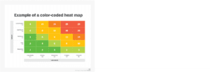
- Heat Maps:
- It visualizes the magnitude of a phenomenon in a matrix format.
- A heat map (or heatmap) is a 2-dimensional data visualization technique that represents the magnitude of individual values within a dataset as a color. The color variation may be by hue or intensity basis.
- Charts and Graphs:
Data Visualisation Process
- The data visualization process involves several stages, from understanding the data to designing and presenting visualizations.
- The data visualization process involves several steps to effectively communicate insights from data. By using these steps properly, we can create data visualizations that effectively communicate insights and drive informed decision-making.
- Define objectives and know your audience:
- The first step in the data visualization process is to understand the purpose of the visualization and who will be using it. What insights are we trying to convey? Tailor your visualization to suit the needs and understanding of your audience.
- In this step, the problem is identified we’re trying to solve. What vital strategic question are we going to answer?
- In order to answer those questions, we’ll need to know what our KPIs (key performance indicators) are. More data isn’t always better — what we need is the right data for the right question and choosing the best pieces of the puzzle to highlight relies on a solid understanding of what you want to measure.
- In other words, we clearly define the purpose of the visualization. Understand what insights we want to convey and who our target audience is. Knowing our objectives helps guide the entire process.
- Data collection and preparation:
- The next step is to gather relevant data from various sources. This may involve cleaning, transforming, and structuring the data to make it suitable for visualization.
- Data preparation is also completed which includes handling missing values, outliers, and any other data anomalies.
- In this step, the relevant data is gathered from various sources and ensure that the data is accurate, complete, and in a format suitable for visualization.
- If necessary cleaning, transformation, or pre-processing are also performed.
- Explore the Data:
- Exploratory data analysis is conducted to understand the characteristics of the data. It helps in identifying patterns, trends, and outliers (a person, thing, or fact that is very different from other people, things, or facts, so that it cannot be used to draw general conclusions).
- This step helps in determining the most effective ways to represent the information visually.
- Choose appropriate visualization techniques:
- Now the most suitable visualization methods are selected which is based on the type/nature of data and the insights we want to convey.
- Common types of visualizations include bar charts, line charts, scatter plots, histograms, pie charts, heat maps, and more.
- No matter our audience, it’s important to keep the visualizations as simple as possible. The more complicated the visual, the more difficult it will be to make decisions and recommendations from its content.
- Design the visualization:
- Now the selected visualization methods are designed following principles of simplicity, clarity, consistency, and effectiveness. For this, the appropriate colors, fonts, scales, and layouts are chosen to enhance readability and understanding.
- Also, we can use proper annotations, labels, and legends to provide context and explanation to improve the visualization effect.
- It is also ensured that the design aligns with the audience’s preferences and the objectives of the visualization.
- Create the visualization:
- Now suitable visualization methods are trying to be created by using suitable data visualization tools or programming libraries (such as Matplotlib, Seaborn, ggplot2, D3.js, Power BI, Tableau, etc.) to generate effective visualizations.
- In this process, it is ensured that the visualizations accurately represent the underlying data and effectively convey the intended message.
- Coding languages like JavaScript, Python, and R are often used for custom visualizations.
- Iterate and refine:
- Now the created visualization is reviewed and solicit feedback from stakeholders or peers.
- Further, Iteration is continued on the design and making refinements as necessary to improve clarity and effectiveness.
- This may involve adjusting visualization parameters, changing chart types, or refining the overall layout.
- It is possible that the first version of a visualization might not be perfect so this can be Iterated and refined the visualizations based on feedback, usability testing, and further exploration of the data.
- Add Interactivity (if needed):
- It may also be added some interactive features to enhance user engagement such as tooltips, zooming, filtering, and the ability to switch between different views or data slices.
- Interpret and analyze:
- Once the visualizations are created, they should interpret the patterns, trends, and insights revealed by the data.
- Now the key findings are identified and consider how they align with the initial objectives.
- The data is explored further if necessary to gain deeper insights.
- Test and Validate:
- Now, the visualizations are thoroughly tested to identify any errors or inconsistencies.
- This step also validates the accuracy of the data representation and ensures that the visualizations align with the original data.
- Tell a Story (if applicable):
- If analysts create a series of visualizations or a dashboard, consider how they fit together to tell a cohesive story to guide the viewer through the data, highlighting key points and insights.
- Communicate findings:
- Now the visualizations are presented along with the accompanying analysis to stakeholders or decision-makers and clearly communicate the insights derived from the data and provide any necessary context or explanations.
- Finally, tailor the presentation to the audience’s level of understanding and expertise.
- Feedback and reflection:
- The feedback is gathered on the visualizations and the insights presented. This is reflected on the effectiveness of the visualization process and identifies any areas for improvement.
- This feedback is used to inform future data visualization projects and refine your skills.
- Finalize and Implement:
- It is made final adjustments based on feedback and testing then implement the visualization in the chosen platform or medium, whether it’s a web page, a presentation, or a printed report.
- Document and Share:
- Ultimately, create and provide documentation of visualization that explains the context, methodology, and any assumptions made during the visualization process and share the visualizations with the target audience, and be prepared to address questions or provide additional insights.
- Define objectives and know your audience:
![]()
0 Comments